Home Sensing Primer Glossary Physics Related Technologies Acknowledgements
Hyperspectral Digital Data
We know that multispectral analysis involves images from two or more bands. But when you start dealing with more than about a dozen bands
in your data set, you have entered the world of hyperspectral analysis. Actually, there is no consensus on the exact difference between
multispectral and hyperspectral analysis. However, in practice the distinction is usually fairly obvious as
multispectral research usually involves 3-6 bands, while hyperspectral research may have 200 bands of data. As we shall see,
having more bands has both advantages and disadvantages.
In hyperspectral work, the spectrum is divided into a myriad of little bands (a.k.a. channels), and then the data from each
narrow-bandwidth channel is used to create distinct images.
Suppose you have a 1000×1400 pixel image
(i.e. 1.4 million pixels) sampled at 130 wavelength bands throughout the visible and near-infrared spectrum.
You could think of your hyperspectral data in two different ways.
First (and most intuitively), the data set can be thought of a stack of 130 images. The pixel dimensions of each image
is 1000×1400. Each image records only the photons from a specific, narrow band of wavelengths. Remember the simple three-image
data stack from the previous web page in this primer? Well, your 130-image data stack in this hyperspectral data set would be much
more impressive:
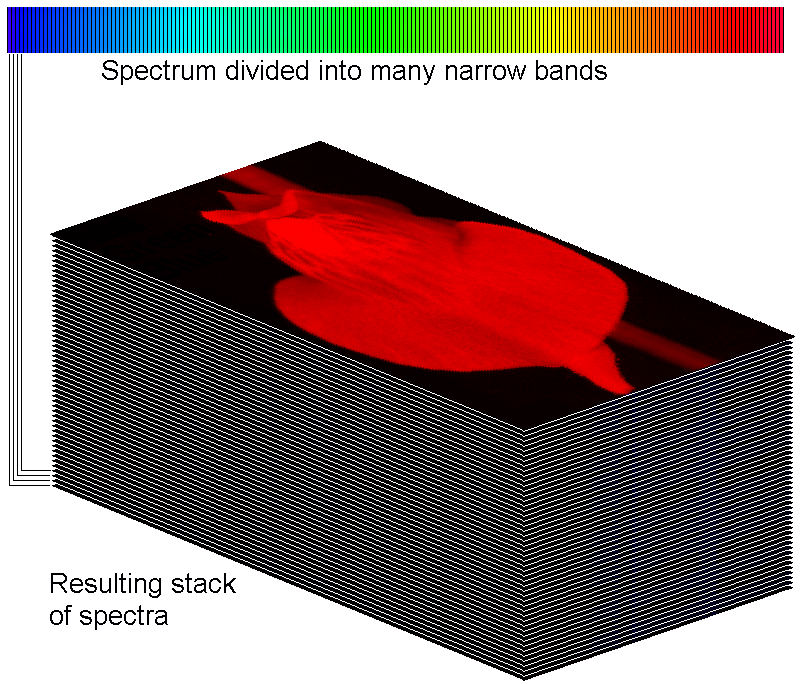
A mucho-impressive, hyperspectral image stack
In the above data stack, you can see how the spectrum has been sliced into 130 channels, and the intensity data from each
channel has been used to make 130 images. I have drawn four lines on the left showing you how the four bluest channels contribute to
four images at the bottom of the stack.
The second way to think of your data is as 1.4 million different spectra. Each spectrum consists of 130 data points along
the visible/near-infrared spectrum. In the figure below, I indicate four spectra from the 1.4 million, and I specify the x-y coordinates
that mark their x-y positions on the image plane.
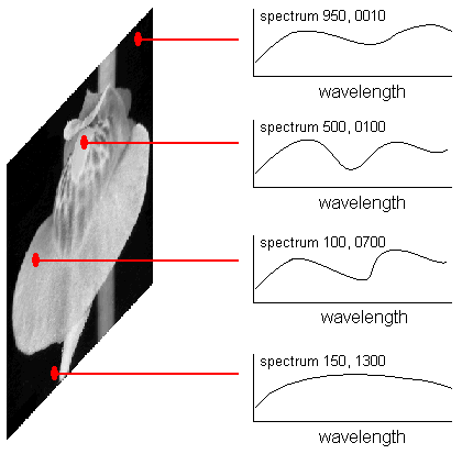
Four spectra, and the x-y coordinates, from the set of 1.4 million
Note that in either interpretation, if you want to specify an individual intensity value in your huge data set, you must specify the two spatial coordinates on the image, plus the wavelength coordinate. Call the spatial coordinates "x" and "y" and the wavelength coordinate "z," and you have a three-dimensional data cube. Image cubes can look very cool, below is the actual data cube from the AVIRIS sensor. This data cube consists of 224 spectral layers. The intensity information in each layer is coded into colors (blue means little energy, yellow means more, and red means even more. It is a little confusing, but makes for a great graphic. If your data is even more complicated (for example, suppose you have repeat observations at different seasons), you have a hyperdimensional data cube. Geeks giving presentations love saying "hyperdimensional data cube." It makes them feel like they are on Star Trek.
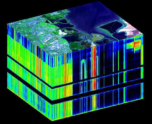
AVIRIS data cube, Moffet Field Airport (California). Cool!
In this data cube, do you notice the two layers where there is no data? These are due to
atmospheric absorption bands. (Specifically, H2O at 1.5 and 2.0 microns.)